Dedicated to type design and typography,
applied to strategic, lasting identities.
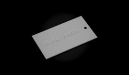
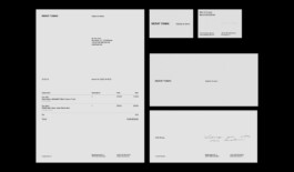
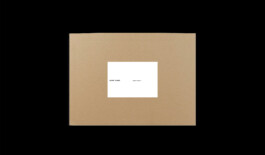
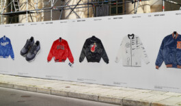
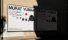
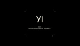
MURAT YUMAK
Murat Yumak, a passionate collector of garments, sneakers, and design objects, sought a concept to showcase and sell his curated archive of vintage items—a space for like-minded individuals to find inspiration, knowledge, and their personal holy grail. This concept contrasts with the fast-paced, mass-produced nature of the modern vintage market dominated by hauls, container shipments, and quick sales through stories and reels.
The design takes inspiration from galleries and museums—spaces that are considered works of art in their own right, defined by their architecture and interior design. The aim was to create an environment that does not overshadow the items on display but instead honors them through thoughtful, minimalist design. The identity draws from the mood of 20th-century Swiss typography, creating a timeless feel that complements the curated collection.
The wordmark mirrors the distinctive style of Murat Yumak, while the overall identity is marked by simplicity. The e-commerce solution is designed as a digital exhibition catalog, providing a gallery-like browsing experience. The layout is based on a strict, yet user-adjustable image grid, or a text-only index for a personalized shopping experience. Large, sterile product images enhance the museum-like atmosphere, allowing the items to take center stage. Once sold, the products remain visible, becoming part of the ever-evolving archive.
Photography: Jack Hare
With: Maryan Ivasyk, Songie Yoon and Niclas Resch for: Navarra
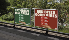

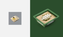
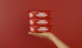
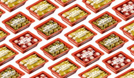

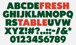
TABLE FOODS
In 2020, Perla, a major player in the German food market, set out to transform into a plant-based and eco-friendly brand. This overhaul included updating its name, visual identity, packaging, communication, and campaigns to emphasize sustainability and modern values, resulting in a fresh brand poised to disrupt the ready-to-eat market.
Focusing on shared dining experiences, the brand embraces positive change, innovation, and healthy eating, with a playful tone tailored to its two main product lines. The visual identity balances scalability, product organization, and market distinction.
Inspired by an early 20th-century Grotesque typeface, the design integrates “teilen” (German for “to share” and “to divide”) into the slogan “Gemacht zum teilen” (“Meant to be shared”). Bold colors, bold typography, and modern paper-tray packaging create a vibrant, approachable brand presence.
With: Maryan Ivasyk and Songie Yoon for: Navarra


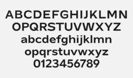
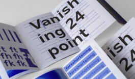
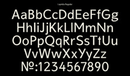
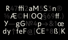
PERSPECTIVE GROTESK
Perspective Grotesk is an ongoing type design project exploring the possibilities of a duplexed typeface with five distinct cuts. This unique construction allows for seamless transitions between typographic styles without affecting text wrapping or disrupting the layout.
Characterized by precise detailing, Perspective Grotesk features angled ascenders, vertical-cut finials, and a wide structure—elements that contribute to its distinctive character without overwhelming the composition. Balancing functionality and personality, the typeface offers versatility for contemporary design applications while maintaining a strong, recognizable identity.
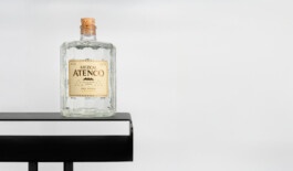
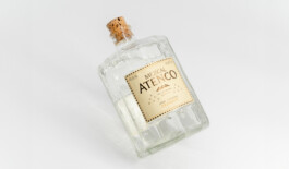
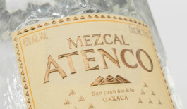
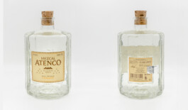
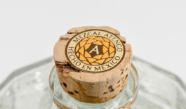
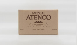
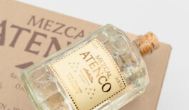
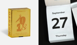
MEZCAL ATENCO
Mezcal Atenco, a hand-filled and hand-numbered mezcal from Oaxaca, is presented in a custom-designed bottle crafted from artisanal glass in Mexico. The branding draws inspiration from the agave plant and the meticulous handcrafted distillation process, creating a deep connection to its origins and surroundings.
A woodcut-inspired typeface reflects the artisanal nature of the mezcal, while every design element ties back to the brand's heritage. The triangular shapes on the label and the bottle’s faceted design are inspired by the agave leaves, while the mountain emblem symbolizes the pure water flowing from the mountains to the valley, essential to the distillation process. The cork seal completes the story, mimicking the view of the agave plant from above.
For: Willem Stratmann / Studio Anti
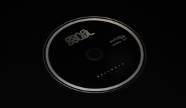


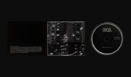

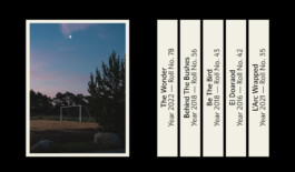
CONFUNKTION RECORDS
Confunktion Records is a funk label dedicated to keeping the tradition of physical records alive through carefully crafted small-run pressings. To support this vision, a cohesive design system was developed for both 7-inch and 12-inch vinyl releases, ensuring a distinctive and recognizable identity across all formats.
To enhance visibility in digital spaces, the logo was later animated, creating a dynamic presence on social media while adding depth to the label’s overall aesthetic. By bridging the gap between analog craftsmanship and contemporary design, Confunktion Records preserves the essence of funk in both sound and visuals.

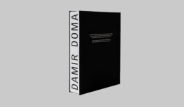
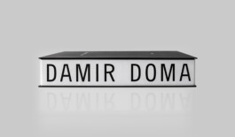
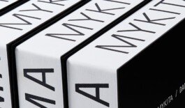
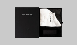
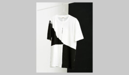
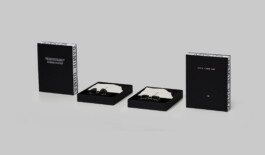
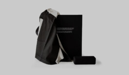
MYKITA / DAMIR DOMA
Designed for the MYKITA / Damir Doma collaboration, this limited-edition packaging concept reflects the refined aesthetic of both brands. Each set includes the Charlotte or Achilles sunglasses, paired with an origami-folded, screen-printed Damir Doma T-shirt—limited to just 300 sets per model.
The packaging balances function and elegance. A slip-case, secured with a screen-printed elastic fabric strap, acts as a distinctive closing mechanism, while the inner box features a felt-covered cardboard inlay, providing a tactile and and sophisticated presentation. More than just housing the contents, the entire packaging system is designed to serve as a display element at the point of sale, seamlessly integrating product presentation with brand experience.
For: MYKITA

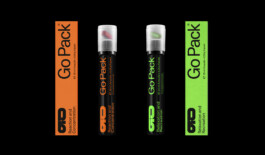
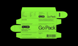
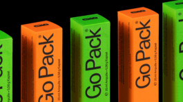
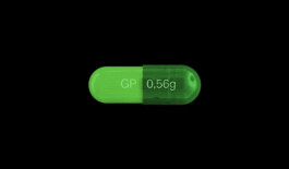
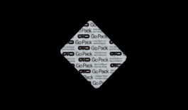
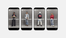
GOPACK
GoPack is a CBD supplement brand designed for professional esports gamers. The brand blends a gamer-inspired aesthetic with a clean, sophisticated look, standing apart from common video game and esports aesthetics.
Drawing inspiration from in-game "medikits" and power-ups that enhance player abilities, the product is visualized with dynamic, floating elements to evoke the idea of game-enhancing tools. The packaging uses the typeface “Unica 77,” maintaining a clean, medical-inspired design with a straightforward information hierarchy, emphasizing clarity and reliability.
The two-color-coded system distinguishes product lines: orange for focus and reaction before gaming, and green for relaxation afterward. The crosshair-inspired logo reinforces precision, with a tunnel effect symbolizing the transition from intense focus to relaxation.
The visual identity extends across packaging and a mobile-first webshop, designed for easy, seamless interaction with UI elements placed conveniently at the bottom of the screen.
With: Maryan Ivasyk and Niclas Resch for: Navarra

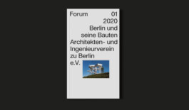
AIV
Founded in 1824, the AIV has a rich heritage, particularly valued by its members. To honor this legacy, the logo was carefully refined rather than completely redesigned. The previously dark blue, which appeared outdated and difficult to reproduce in print, was replaced with a more vibrant blue that is now primarily used in display applications.
The new brand identity centers around a self-confident and stable wordmark, with the logo serving as a supplementary element in initial brand touchpoints or as a supporting detail to elevate the overall design.
As part of the rebrand, the website was completely overhauled with a blog-inspired layout, now serving as the association’s main communication platform. Additionally, a dynamic system was developed to seamlessly integrate both online and offline applications.
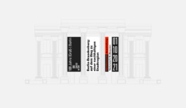
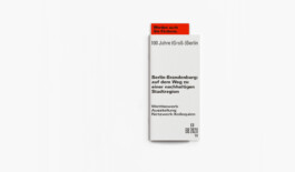
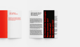
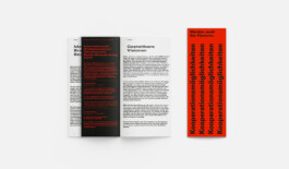
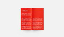
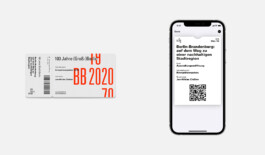
BB2020
BB2020 marks the 100th anniversary of the AIV’s “Greater Berlin” project, originally established in 1920. The anniversary is centered around an international urban design competition, with its results showcased in a dedicated exhibition.
To support communication efforts and attract investor interest, a bold visual identity with a versatile typographic system was developed. The logo forms the foundation of the identity, bridging the past and the present by highlighting the year of the event while setting the course for the future.
A vibrant red-orange—an intensified version of Berlin’s corporate red—serves as the primary color, paired with black for competition-related materials. For display purposes, the logo was animated, incorporating an animated typeface to reflect the transformative and dynamic nature of the anniversary and its competition.
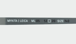
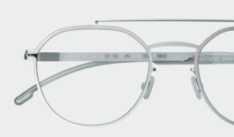
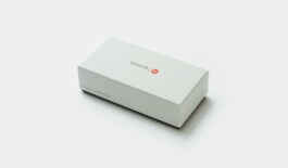
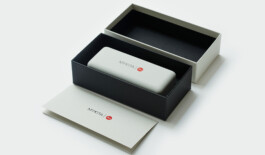
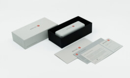
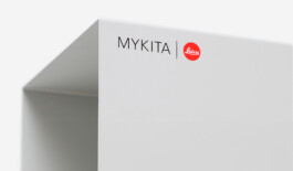
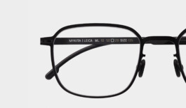
MYKITA Leica
For the partnership between Mykita and Leica, I developed comprehensive design guidelines, ensuring a seamless and cohesive visual identity across all touchpoints. This included the creation of point-of-sale (POS) elements that reflect the precision and craftsmanship both brands are renowned for.
The packaging design was carefully crafted to embody the collaboration's values—blending Mykita’s modern aesthetic with Leica’s legacy of technical excellence. Each detail was considered, from material choices to finishes, resulting in a premium unboxing experience that underscores the synergy between the two iconic brands.
Through these efforts, the collaboration was brought to life with a unified design language that communicates sophistication, innovation, and timeless quality at every level.
For: MYKITA
2025 Christoph Brandes
Dedicated to type design
and typography,
applied to strategic,
lasting identities.
MURAT YUMAK
Murat Yumak, a passionate collector of garments, sneakers, and design objects, sought a concept to showcase and sell his curated archive of vintage items—a space for like-minded individuals to find inspiration, knowledge, and their personal holy grail. This concept contrasts with the fast-paced, mass-produced nature of the modern vintage market dominated by hauls, container shipments, and quick sales through stories and reels.
The design takes inspiration from galleries and museums—spaces that are considered works of art in their own right, defined by their architecture and interior design. The aim was to create an environment that does not overshadow the items on display but instead honors them through thoughtful, minimalist design. The identity draws from the mood of 20th-century Swiss typography, creating a timeless feel that complements the curated collection.
The wordmark mirrors the distinctive style of Murat Yumak, while the overall identity is marked by simplicity. The e-commerce solution is designed as a digital exhibition catalog, providing a gallery-like browsing experience. The layout is based on a strict, yet user-adjustable image grid, or a text-only index for a personalized shopping experience. Large, sterile product images enhance the museum-like atmosphere, allowing the items to take center stage. Once sold, the products remain visible, becoming part of the ever-evolving archive.
Photography: Jack Hare
With: Maryan Ivasyk, Songie Yoon and Niclas Resch for: Navarra
GOPACK
GoPack is a CBD supplement brand designed for professional esports gamers. The brand blends a gamer-inspired aesthetic with a clean, sophisticated look, standing apart from common video game and esports aesthetics.
Drawing inspiration from in-game "medikits" and power-ups that enhance player abilities, the product is visualized with dynamic, floating elements to evoke the idea of game-enhancing tools. The packaging uses the typeface “Unica 77,” maintaining a clean, medical-inspired design with a straightforward information hierarchy, emphasizing clarity and reliability.
The two-color-coded system distinguishes product lines: orange for focus and reaction before gaming, and green for relaxation afterward. The crosshair-inspired logo reinforces precision, with a tunnel effect symbolizing the transition from intense focus to relaxation.
The visual identity extends across packaging and a mobile-first webshop, designed for easy, seamless interaction with UI elements placed conveniently at the bottom of the screen.
With: Maryan Ivasyk and Niclas Resch for: Navarra
TABLE FOODS
In 2020, Perla, a major player in the German food market, set out to transform into a plant-based and eco-friendly brand. This overhaul included updating its name, visual identity, packaging, communication, and campaigns to emphasize sustainability and modern values, resulting in a fresh brand poised to disrupt the ready-to-eat market.
Focusing on shared dining experiences, the brand embraces positive change, innovation, and healthy eating, with a playful tone tailored to its two main product lines. The visual identity balances scalability, product organization, and market distinction.
Inspired by an early 20th-century Grotesque typeface, the design integrates “teilen” (German for “to share” and “to divide”) into the slogan “Gemacht zum teilen” (“Meant to be shared”). Bold colors, bold typography, and modern paper-tray packaging create a vibrant, approachable brand presence.
With: Maryan Ivasyk and Songie Yoon for: Navarra
MYKITA / DAMIR DOMA
Designed for the MYKITA / Damir Doma collaboration, this limited-edition packaging concept reflects the refined aesthetic of both brands. Each set includes the Charlotte or Achilles sunglasses, paired with an origami-folded, screen-printed Damir Doma T-shirt—limited to just 300 sets per model.
The packaging balances function and elegance. A slip-case, secured with a screen-printed elastic fabric strap, acts as a distinctive closing mechanism, while the inner box features a felt-covered cardboard inlay, providing a tactile and and sophisticated presentation. More than just housing the contents, the entire packaging system is designed to serve as a display element at the point of sale, seamlessly integrating product presentation with brand experience.
For: MYKITA
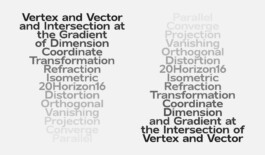
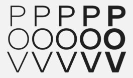
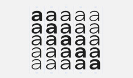
PERSPECTIVE GROTESK
Perspective Grotesk is an ongoing type design project exploring the possibilities of a duplexed typeface with five distinct cuts. This unique construction allows for seamless transitions between typographic styles without affecting text wrapping or disrupting the layout.
Characterized by precise detailing, Perspective Grotesk features angled ascenders, vertical-cut finials, and a wide structure—elements that contribute to its distinctive character without overwhelming the composition. Balancing functionality and personality, the typeface offers versatility for contemporary design applications while maintaining a strong, recognizable identity.
AIV
Founded in 1824, the AIV has a rich heritage, particularly valued by its members. To honor this legacy, the logo was carefully refined rather than completely redesigned. The previously dark blue, which appeared outdated and difficult to reproduce in print, was replaced with a more vibrant blue that is now primarily used in display applications.
The new brand identity centers around a self-confident and stable wordmark, with the logo serving as a supplementary element in initial brand touchpoints or as a supporting detail to elevate the overall design.
As part of the rebrand, the website was completely overhauled with a blog-inspired layout, now serving as the association’s main communication platform. Additionally, a dynamic system was developed to seamlessly integrate both online and offline applications.
MEZCAL ATENCO
Mezcal Atenco, a hand-filled and hand-numbered mezcal from Oaxaca, is presented in a custom-designed bottle crafted from artisanal glass in Mexico. The branding draws inspiration from the agave plant and the meticulous handcrafted distillation process, creating a deep connection to its origins and surroundings.
A woodcut-inspired typeface reflects the artisanal nature of the mezcal, while every design element ties back to the brand's heritage. The triangular shapes on the label and the bottle’s faceted design are inspired by the agave leaves, while the mountain emblem symbolizes the pure water flowing from the mountains to the valley, essential to the distillation process. The cork seal completes the story, mimicking the view of the agave plant from above.
For: Willem Stratmann / Studio Anti
BB2020
BB2020 marks the 100th anniversary of the AIV’s “Greater Berlin” project, originally established in 1920. The anniversary is centered around an international urban design competition, with its results showcased in a dedicated exhibition.
To support communication efforts and attract investor interest, a bold visual identity with a versatile typographic system was developed. The logo forms the foundation of the identity, bridging the past and the present by highlighting the year of the event while setting the course for the future.
A vibrant red-orange—an intensified version of Berlin’s corporate red—serves as the primary color, paired with black for competition-related materials. For display purposes, the logo was animated, incorporating an animated typeface to reflect the transformative and dynamic nature of the anniversary and its competition.
CONFUNKTION RECORDS
Confunktion Records is a funk label dedicated to keeping the tradition of physical records alive through carefully crafted small-run pressings. To support this vision, a cohesive design system was developed for both 7-inch and 12-inch vinyl releases, ensuring a distinctive and recognizable identity across all formats.
To enhance visibility in digital spaces, the logo was later animated, creating a dynamic presence on social media while adding depth to the label’s overall aesthetic. By bridging the gap between analog craftsmanship and contemporary design, Confunktion Records preserves the essence of funk in both sound and visuals.
MYKITA Leica
For the partnership between Mykita and Leica, I developed comprehensive design guidelines, ensuring a seamless and cohesive visual identity across all touchpoints. This included the creation of point-of-sale (POS) elements that reflect the precision and craftsmanship both brands are renowned for.
The packaging design was carefully crafted to embody the collaboration's values—blending Mykita’s modern aesthetic with Leica’s legacy of technical excellence. Each detail was considered, from material choices to finishes, resulting in a premium unboxing experience that underscores the synergy between the two iconic brands.
Through these efforts, the collaboration was brought to life with a unified design language that communicates sophistication, innovation, and timeless quality at every level.
For: MYKITA
All rights reserved © 2025 Christoph Brandes
Last update 24 January 2025